About the Project
Cellcom: Brand transformation and digital commerce
Year:
Role:
Skills:
Overview
Cellcom is one of the largest regional wireless providers in the Midwest, serving customers across Wisconsin with mobile, internet, and business communication services. While the company had built a loyal customer base over decades, its brand and digital experience no longer reflected the quality of its products or its ambitions for future growth.
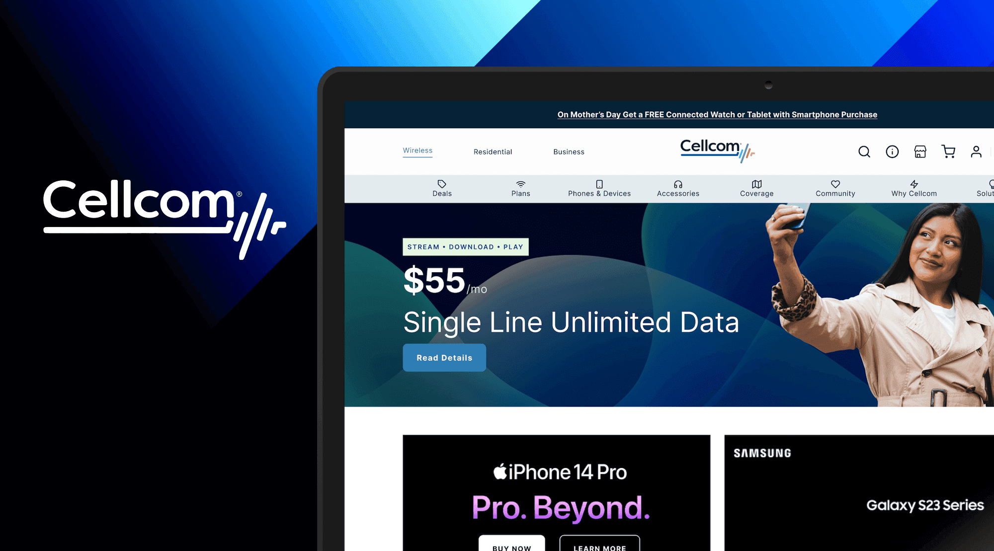
What began as a website redesign quickly evolved into a full-scale brand transformation. Following the success of the initial UX work, I was asked to lead the redesign of Cellcom's visual identity, including its logo, brand system, website, e-commerce experience, and supporting marketing assets.
Over approximately six months, I partnered closely with executive leadership, marketing, and the internal design team to create a modern, customer-centered brand that honored Cellcom's reputation while positioning the company to attract a new generation of customers. The engagement culminated in the successful launch of a refreshed brand identity and a completely redesigned digital experience that established a cohesive foundation for future growth.

UX audit of existing Cellcom e-commerce website
My Role
As Headway's Design Lead, I operated as the Creative Director for the engagement, partnering directly with the Senior Director of Public Affairs, Senior Marketing Communications Manager, and the internal Senior Web Designer throughout the project.
My responsibilities included leading UX strategy for the website redesign, conducting design discovery, defining the creative direction for the rebrand, designing the new logo and visual identity, establishing the color palette, typography, and imagery system, and redesigning the end-to-end website experience.
I also led the redesign of the e-commerce experience, including service plan browsing, product detail pages, shopping cart, and checkout, ensuring the brand and user experience worked together to create a cohesive customer journey.
Throughout the engagement, I presented concepts to executive stakeholders, facilitated design reviews, and guided another designer while ensuring consistency across both the digital product and the broader brand ecosystem.

Figma files for developer hand-off
The Challenge
Cellcom had earned a strong reputation for customer service and community involvement, but its digital presence no longer reflected the quality of the business. The website felt dated, the shopping experience required unnecessary effort, and the visual identity struggled to differentiate the company from larger national competitors.
The challenge extended beyond aesthetics.
As a regional wireless provider competing against brands like Verizon and AT&T, Cellcom needed to appeal to younger customers without alienating the loyal families and long-time subscribers who had built the business. Research from the client suggested that while parents frequently remained Cellcom customers, many younger family members left for national carriers as they became financially independent.
At the same time, the company wanted to reinforce its brand promise of "Technology with a Heartbeat." Rather than simply modernizing the visual design, the project needed to communicate that Cellcom combined innovative technology with the personalized service and community values that had always distinguished the company.
The challenge became balancing modernization with familiarity, creating a brand and digital experience that felt fresh and contemporary while preserving the trust customers had built over decades.

Product details page before and after

Calling plan details page before and after
Discovery, Strategy & Vision
The engagement began with a comprehensive evaluation of both the existing brand and digital experience.
Through stakeholder workshops, competitive analysis, and a UX audit of the current website, we identified recurring friction throughout the customer journey. Navigation was difficult to scan, the shopping experience lacked clarity, and the visual language failed to communicate the personality or differentiation of the brand.
Conversations with leadership also revealed that the organization was looking for more than a redesigned website. They wanted a brand that could support the company's long-term evolution and resonate with emerging customer segments while remaining authentic to their history and values.
This research shaped several strategic principles that guided the project.
Modernize without losing trust. The brand needed to feel contemporary while remaining approachable and recognizable to existing customers.
Humanize technology. Every aspect of the experience needed to reinforce Cellcom's commitment to personal relationships and community rather than competing solely on technology specifications.
Create one connected brand system. The logo, website, retail experience, marketing materials, and digital products all needed to communicate a consistent visual language.
Reduce friction throughout the buying journey. Purchasing wireless plans and devices should feel simple, transparent, and intuitive.
These principles informed every design decision, from the visual identity to the smallest interaction within the e-commerce experience.

Checkout experience before and after
The Process
The redesign began with the customer experience before moving into visual identity.
I first completed a UX audit of the existing website to identify usability issues across navigation, information architecture, product discovery, and purchasing workflows. These findings became the roadmap for redesigning the site's structure and simplifying key customer journeys.
As the engagement expanded, I shifted into developing the new brand identity.
The logo exploration centered on Cellcom's brand promise, "Technology with a Heartbeat." Rather than creating an entirely unrelated symbol, I evolved the existing identity into a more modern mark that incorporated the visual rhythm of a heartbeat while subtly echoing ascending cellular signal bars. This approach preserved brand recognition while creating a stronger emotional connection between the company's mission and its visual identity.
Once the identity system was established, I developed a new color palette, typography system, imagery direction, and supporting brand guidelines that could be applied consistently across digital and physical touch points.
The website redesign then brought the new brand to life.
Every major customer journey was reconsidered, including browsing wireless plans, comparing services, exploring devices, reviewing product details, and completing purchases through the redesigned shopping cart and checkout experience.
Rather than treating branding and UX as separate disciplines, the two evolved together. Visual hierarchy, photography, typography, interaction design, and messaging were developed as one integrated system, allowing the website to communicate Cellcom's personality while improving usability.
Throughout the project, I worked closely with marketing, engineering, and executive leadership, presenting iterative concepts, incorporating stakeholder feedback, and ensuring business goals remained aligned with customer needs.

Updated Cellcom branding assets
Outcomes & Results
The engagement resulted in a comprehensive transformation of both the Cellcom brand and its digital customer experience.
The new visual identity modernized the company's appearance while maintaining continuity with its established reputation. The refreshed logo, expanded color palette, typography system, and imagery guidelines created a flexible brand foundation that could support future marketing initiatives across digital and physical channels.
The redesigned website significantly improved the customer journey by simplifying navigation, clarifying service offerings, and streamlining the end-to-end purchasing experience. From plan comparison through checkout, the experience became easier to understand and more intuitive to navigate.
Beyond the customer-facing improvements, the project provided Cellcom with a cohesive design system that connected branding, marketing, and product experience under a single visual language. This consistency strengthened the company's ability to communicate with customers while positioning the brand for continued growth in an increasingly competitive market.
The successful launch of both the rebrand and redesigned website demonstrated the value of approaching brand strategy and product design as complementary disciplines rather than separate initiatives.

Updated Cellcom storefront with the new logo
Leadership Lessons & Key Takeaways
This project reinforced that successful brands are built through experiences, not just visual identities.
While designing the logo and visual system was an exciting creative challenge, the greatest impact came from ensuring those decisions improved the customer journey rather than existing independently of it. Every interaction, from browsing service plans to completing checkout, became an opportunity to reinforce the same promise expressed by the brand itself.
The engagement also strengthened my ability to guide organizations through large-scale change. Rebranding a well-established company requires balancing innovation with familiarity, encouraging stakeholders to embrace new ideas while respecting the history and equity already built into the brand.
Perhaps the most valuable lesson was recognizing that effective design leadership often means expanding the conversation beyond individual deliverables. By connecting business strategy, brand identity, and user experience into one cohesive vision, we created an outcome that was more meaningful than a redesigned website or a new logo alone. We helped position Cellcom for its next chapter while remaining true to the values that had made the company successful for decades.