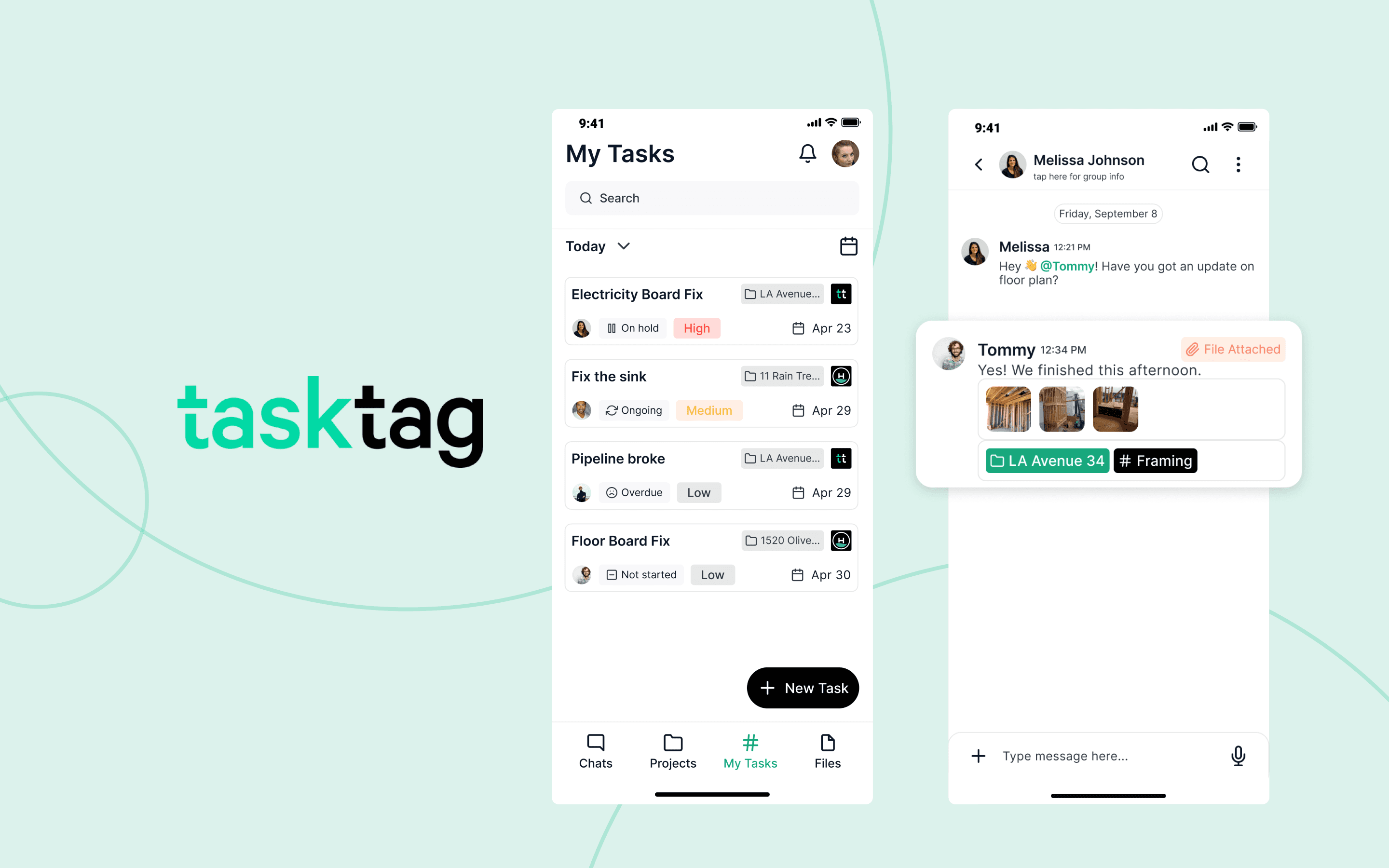
About the Project
TaskTag: Early stage construction management platform design
Year:
Role:
Skills:
Overview
Tasktag is a construction management platform designed to help general contractors and subcontractors coordinate work, communicate updates, and manage project tasks across desktop and mobile devices.
When I joined the engagement, the product had an internal beta, but the experience had been assembled quickly and lacked the consistency, clarity, and usability needed for a broader external release. The team needed to evolve the platform from a functional early product into an intuitive, scalable experience that small construction businesses could confidently adopt.
Over approximately six months, I led a comprehensive UX audit and product redesign spanning the platform’s information architecture, core workflows, interaction patterns, and visual design. Working closely with the founders, product stakeholders, engineers, and another designer, I helped translate customer research into a clearer product strategy and a more cohesive experience across desktop and mobile.
The result was a significantly more usable and consistent platform, supported by scalable design patterns and grounded in the realities of how construction teams communicate and coordinate work in the field.
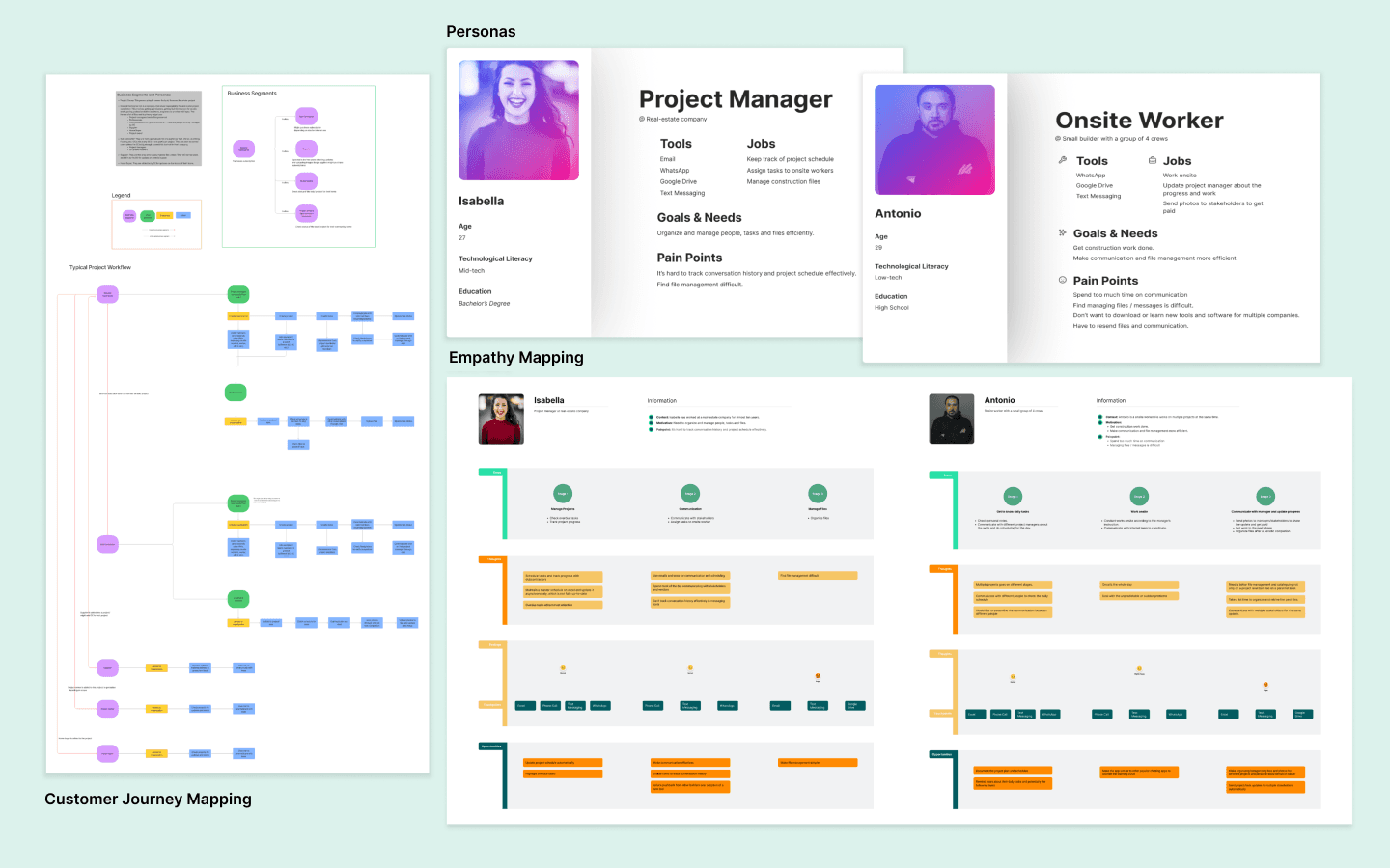
Early exercises for personas, customer journey and empathy mapping
My Role
I served as the lead product designer and design strategist for the engagement, owning the experience from initial research and evaluation through redesign and implementation support.
As Design Lead, I owned the overall UX strategy and product direction while managing a team consisting of two client designers and one Headway product designer. My responsibilities included conducting a comprehensive UX audit, partnering on customer interviews, synthesizing research findings, redefining the information architecture, and establishing a clearer product vision for the external beta.
I led the redesign of foundational workflows across desktop and mobile, including task management, scheduling, navigation, project communication, and the interaction patterns used throughout the application. I also established standards for accessibility, visual hierarchy, headers, calls to action, confirmation states, bottom sheets, and pop-up menus.
Throughout the engagement, I worked closely with product and engineering to balance customer needs with technical constraints and startup priorities. I also helped the team determine which usability problems needed to be addressed before launch and which enhancements could be introduced incrementally as the product matured.
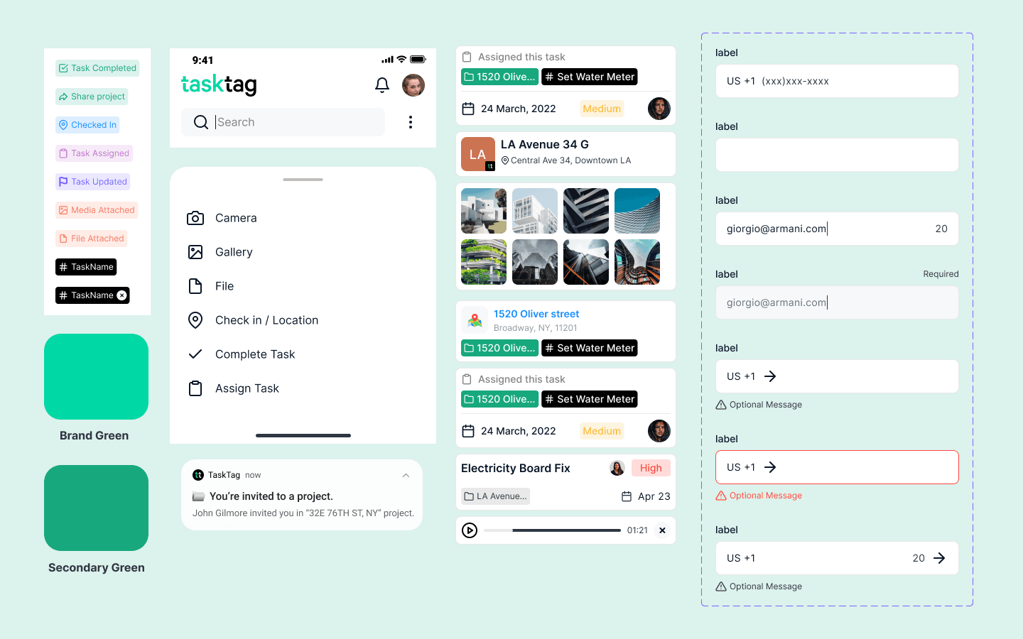
Design system components
The Challenge
Construction projects depend on constant communication between general contractors, subcontractors, project managers, and field teams. However, many smaller construction businesses still coordinate work through a fragmented combination of text messages, phone calls, spreadsheets, and informal notes.
Tasktag had an opportunity to bring those interactions into a single platform, but the early beta introduced its own complexity. Inconsistent navigation, unclear terminology, repetitive interface patterns, and weak visual hierarchy made it difficult for users to understand where they were, what required attention, and what would happen after completing an action.
The platform also had to serve users with varying levels of technical confidence. Many of the target customers were small subcontractor businesses accustomed to managing their work through familiar tools such as text messaging. Asking them to adopt a new platform required more than adding functionality. The experience needed to feel immediately understandable and demonstrate clear value without creating additional administrative work.
The challenge was therefore twofold: improve the usability and consistency of the current product while reshaping it around the real communication habits of construction professionals. We needed to create a system that felt simple enough for first-time users but structured enough to support increasingly complex projects as the product grew.

A/B testing example from the research phase

Before and after of the Projects and Project Details screens
Discovery, Strategy & Vision
We began by speaking directly with the people Tasktag was designed to serve. The team conducted ten interviews with construction professionals, with a particular focus on smaller subcontractor businesses.
The research revealed that text messaging was the primary communication method used to coordinate day-to-day work. It was fast, familiar, and accessible, but it also created significant operational challenges. Important decisions were buried in long message threads, updates were difficult to track, and project managers often had to manually transfer information into separate project management systems.
This created a strategic opportunity for Tasktag. The product did not need to replace the simplicity of text messaging. It needed to preserve that sense of immediacy while adding structure, accountability, and visibility.
Alongside the research, I completed a comprehensive UX audit of the existing beta. The audit identified recurring issues across the platform, including inconsistent component behavior, unclear calls to action, accessibility concerns, weak page hierarchy, and overlapping interaction patterns.
The findings informed several design priorities:
Make tasks the central organizing structure of the product.
Use familiar language that reflected how construction teams already thought about their work.
Establish predictable navigation and page hierarchy across the application.
Reduce ambiguity through descriptive calls to action and confirmation prompts.
Use color consistently to communicate status and functionality.
Improve accessibility through stronger contrast and more legible visual hierarchy.
Create reusable interaction patterns that could scale with the product.
One of the most important strategic changes was reframing the platform around tasks rather than schedules. “Schedule” suggested a calendar-based planning tool, while “Tasks” more accurately reflected the actions users needed to complete, assign, discuss, and monitor. This shift gave the product a clearer conceptual foundation and made its value easier to understand.

Final screens that launched in 2022
The Process
The redesign began by establishing a stronger foundation for the product. Before refining individual screens, I restructured the information architecture, simplified navigation, and standardized recurring interaction patterns to create a more intuitive experience across desktop and mobile.
Using the findings from the UX audit, I introduced a consistent design language that improved accessibility, strengthened visual hierarchy, clarified calls to action, and standardized components such as headers, bottom sheets, pop-up menus, and confirmation states. An eight-pixel grid and more intentional use of color created a cleaner, more predictable interface that reduced cognitive load and improved scan-ability.
I also reframed the platform around Tasks rather than Schedules, giving users a clearer mental model that better reflected how construction teams organize and complete work. This strategic shift simplified navigation while making the product's value proposition more intuitive for first-time users.
Throughout the engagement, designs were iterated collaboratively with product and engineering, allowing user needs, technical constraints, and business priorities to shape the solution together. By focusing on reusable patterns instead of isolated screens, we created a scalable product foundation that could continue evolving beyond the initial beta release.

Final desktop Projects screen with chat interface
Outcomes & Results
The engagement transformed Tasktag from an inconsistent internal beta into a more cohesive and scalable product experience prepared for broader customer use.
The redesigned information architecture gave the platform a clearer organizing model, with tasks positioned as the central unit of work. Standardized navigation, headers, calls to action, and confirmation patterns made the product easier to understand and reduced ambiguity throughout key workflows.
The UX audit also provided the team with a prioritized framework for improving the product beyond the immediate redesign. Rather than addressing usability concerns individually, we established reusable standards for accessibility, spacing, color, hierarchy, bottom sheets, menus, and responsive behavior that could guide future feature development.
The final experience more closely aligned with the working habits uncovered during research. By combining the familiarity and speed users valued in text-based communication with the accountability and organization of a project management platform, Tasktag was better positioned to support small construction businesses without adding unnecessary administrative complexity.
Although the early-stage product did not yet have mature adoption metrics, the redesign created a stronger foundation for the external beta, reduced experience fragmentation, and gave the team a clearer product vision to carry into future releases.

Leadership Lessons & Key Takeaways
Tasktag reinforced the importance of meeting users where they already are rather than expecting them to immediately adopt an entirely new way of working.
The research showed that construction teams relied on text messaging for good reasons: it was quick, familiar, and required almost no training. The opportunity was not to dismiss that behavior as inefficient, but to understand what made it valuable and bring those qualities into a more structured product experience.
The engagement also demonstrated how valuable a UX audit can be when it is used as a strategic tool rather than simply a list of interface issues. The audit helped the team identify recurring systemic problems, prioritize the changes that mattered most for launch, and establish standards that could improve the product over time.
From a leadership perspective, the project strengthened my ability to bring structure to ambiguous, early-stage environments. The team did not need a perfect long-term solution before moving forward. It needed a clear product vision, a shared set of principles, and a practical framework for making better decisions as the platform evolved.
The most important takeaway was that simplicity is not achieved by removing functionality. It comes from helping users understand what matters, what they can do next, and how the product supports the work they are already trying to accomplish.